本例借助Flexbox伸缩盒布局,设计页面呈现3行3列布局样式,同时能够根据窗口自适应调整各自空间,以满屏显示,效果如图11.21所示。
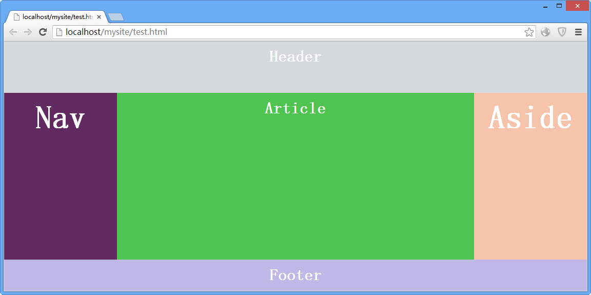
图11.21 HTML5应用文档
页面主要代码如下所示:
<style type="text/css">
/*基本样式*/
* {margin: 0; padding: 0;
     -moz-box-sizing: border-box;
     -webkit-box-sizing: border-box;
    box-sizing:  border-box;
}
html, body {height: 100%; color: #fff;}
body { min-width: 100%; }
header, section, nav, aside, footer { display: block;  text-align:center; font-size:2em; font-weight:bold; }
/*页眉框样式:限高、限宽*/
header {
     background-color: hsla(200,10%,70%,.5);
    min-height:  100px; padding: 10px 20px;
    min-width:  100%;
}
/*主体区域框样式:满宽显示*/
section {min-width: 100%;}
/*导航框样式:固定宽度*/
nav {background-color: hsla(300,60%,20%,.9);padding:  1%;width: 220px;}
/*文档栏样式*/
article {background-color: hsla(120,50%,50%,.9);  padding: 1%;}
/*侧边栏样式:弹性宽度*/
aside {background-color: hsla(20,80%,80%,.9); padding:  1%;width: 220px;}
/*页脚样式:限高、限宽*/
footer {
     background-color: hsla(250,50%,80%,.9);
    min-height:  60px; padding: 1%;
    min-width:  100%;
}
/*flexbox样式*/
body {
    /*设置body为伸缩容器*/
    display:  -webkit-box;/*老版本:iOS 6-, Safari 3.1-6*/
    display:  -moz-box;/*老版本:Firefox 19- */
    display:  -ms-flexbox;/*混合版本:IE10*/
    display:  -webkit-flex;/*新版本:Chrome*/
    display:  flex;/*标准规范:Opera 12.1, Firefox 20+*/
    /*伸缩项目换行*/
     -moz-box-orient: vertical;
    -webkit-box-orient:  vertical;
     -moz-box-direction: normal;
     -moz-box-direction: normal;
     -moz-box-lines: multiple;
     -webkit-box-lines: multiple;
     -webkit-flex-flow: column wrap;
     -ms-flex-flow: column wrap;
    flex-flow:  column wrap;
}
/*实现stick footer效果*/
section {
    display:  -moz-box;
    display:  -webkit-box;
    display:  -ms-flexbox;
    display:  -webkit-flex;
    display:  flex;
     -webkit-box-flex: 1;
     -moz-box-flex: 1;
    -ms-flex: 1;
    -webkit-flex:  1;
    flex: 1;
    -moz-box-orient:  horizontal;
     -webkit-box-orient: horizontal;
     -moz-box-direction: normal;
     -webkit-box-direction: normal;
     -moz-box-lines: multiple;
     -webkit-box-lines: multiple;
     -ms-flex-flow: row wrap;
     -webkit-flex-flow: row wrap;
    flex-flow:  row wrap;
     -moz-box-align: stretch;
     -webkit-box-align: stretch;
     -ms-flex-align: stretch;
     -webkit-align-items: stretch;
    align-items:  stretch;
}
/*文章区域伸缩样式*/
article {
     -moz-box-flex: 1;
     -webkit-box-flex: 1;
    -ms-flex: 1;
    -webkit-flex:  1;
    flex: 1;
     -moz-box-ordinal-group: 2;
     -webkit-box-ordinal-group: 2;
     -ms-flex-order: 2;
     -webkit-order: 2;
    order: 2;
}
/*侧边栏伸缩样式*/
aside {
     -moz-box-ordinal-group: 3;
     -webkit-box-ordinal-group: 3;
    -ms-flex-order:  3;
     -webkit-order: 3;
    order: 3;
}
</style>
<header>Header</header>
<section>
     <article>Article</article>
     <nav>Nav</nav>
     <aside>Aside</aside>
</section>
<footer>Footer</footer>